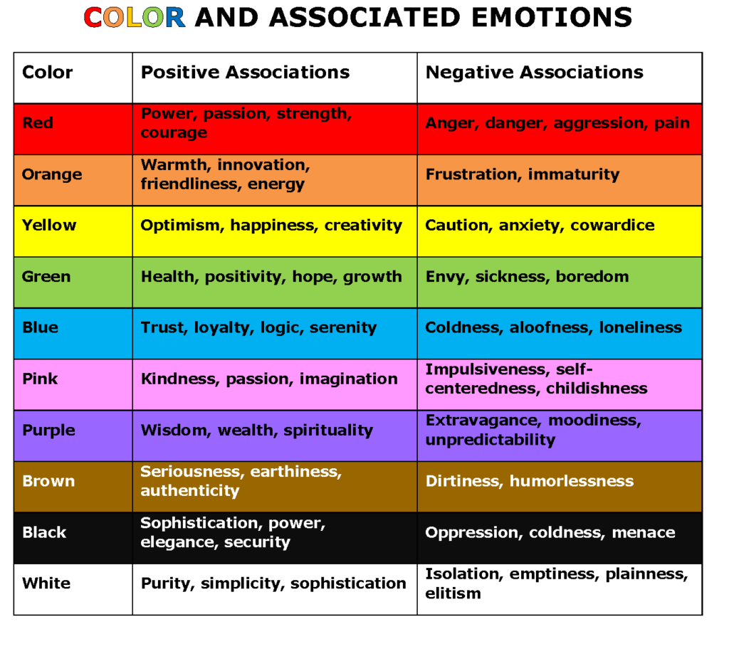
According to noted psychologist and psychiatrist Carl Jung, “colors are the mother tongue of the subconscious.” Jung is credited with early studies that reveal how color affects the human mind. Using the results of his research, Jung developed a form of color art therapy that encouraged patients to express their emotions through color and images. In combination with color theory based on Sir Isaac Newton’s color wheel, color psychology considers how different colors have different meanings, associations and psychological impacts across a variety of individual and cultural norms.
Today, color psychology looks at how color affects our behavior and decision-making. While the overall impact of certain colors is shaped by personal preference, color psychology attempts to define common sensations, associations, values and influences of color. This practice is utilized in graphic design, architecture, marketing, advertising and all types of media.
The Psychology of Common Colors
Research shows that color improves brand recognition by up to 80 percent. This means that customers are 80 percent more likely to identify your brand if you consistently use the same colors in your marketing efforts. While there is no definitive psychological impact of every color, there are some common connections that most individuals will make. Knowing both the positive and negative connotations of certain colors can make a significant difference for your branding and marketing plan, and help you make practical design decisions.

How to Use Color Psychology in Marketing
Once you understand the psychological effects of common colors, you can leverage this knowledge across marketing tactics to impact target audiences in powerful ways. Here are some ways you can use color in your marketing:
- Shape brand identity. While a brand is much more than a logo and a color scheme, your visual identity is often the first impression you make with target audiences. Studies have shown that up to 90 percent of snap judgments made about products can be based on color alone. Start off on the right foot by choosing brand colors that impart the emotions you want associated with your company. Ask yourself these questions: What does our company stand for? What colors showcase our company’s personality, culture and values? What feelings do we want to avoid when people think of our brand?
- Connect with the values of your target market. To make the right first impression and set realistic expectations for your company’s brand, it’s important to consider the values of your target market and align strategically with those goals. This establishes a sense of understanding and trust. Color is one way to communicate this understanding. Seek to define the challenges of your target market, and the beliefs they consider valuable in making a purchase decision. Use color to impact your buyers in a way that resonates with them and stimulate that psychological response throughout your business relationship.
- Develop a palette of brand colors. Too many colors can make for a confusing message and muddled marketing. Experts recommend choosing two or three brand colors and then using shades, tones, hues, intensity and contrast to vary those primary colors as needed. Use a color wheel tool to help identify complementary colors for your brand palette.
- Bolster calls-to-actions with emotional response. Calls-to-action (CTA) are vital stepping-stones to guide prospects through the sales funnel. Whether positioned on your website, or in articles, videos, advertisements, social media or other promotional offer, a CTA answers the question “what now?” A successful CTA evokes urgency, trust and value. Use color and design to bring a CTA to the forefront at the right time, stimulate a powerful emotional response and motivate prospects that are ready to buy.
Get Emotional

In an ocean of brands and messages, color can make your brand stand out from the competition. It takes 10 seconds for people to form an opinion about your logo. What do you want to say in those 10 seconds? When marketers use color psychology effectively, they can influence audiences to experience what they want them to see, feel what they want them to feel and do what they want them to do. On the other hand, poor color choice can negatively change the impact of your message. Get it wrong, and your great content and carefully crafted call to action will be ignored. While you can use color theory to design the ideal palette, the effects it has on your audience are highly individual. Understand that preferences and trends change, so regularly test your colors in marketing materials to determine which color combinations, placements and designs resonate with your audiences and generate the most engagement with your content.
