In digital marketing, a landing page is a standalone web page designed exclusively as a “landing” point for an individual marketing or advertising campaign. The landing page is where users are directed when they click a link from an ad, social media post, email or other marketing initiatives. The dedicated page typically details an offer, often in exchange for the user’s information. The offer might direct users to sign up for a newsletter, mailing list, webinar or event. It might suggest they download valuable content such as a white paper or e-book. Or it might direct them to contact a representative or to make a purchase. A landing page can have many purposes, but its primary role is to propel users to the next stage of the sales funnel.
Eight Keys to a Successful Landing Page
Landing pages might sound simple in their definition. The reality is to be a successful lead generation tool, they require a strategic approach and these eight essential attributes:
- A referring source. A landing page’s design is to guide a prospect to the next vital step in the sales funnel. It is unlikely your target audiences will discover a landing page while browsing your website. Instead, they are directed from a source such as an email, blog, article, social media post or other initiatives. Landing pages don’t convert without a clear path. Ensure there’s a roadmap for targeted prospects to readily discover and click through.
- A clear, singular call to action. A successful landing page has one goal it’s asking users to do. This means the call to action should be the star of the page. The call to action encourages prospects to take an immediate next step. It requires a clear value proposition that answers both “what now?” and “what’s in it for me?” from the customer’s perspective.
- Limited navigation. Just like a focused call to action, simple navigation helps prospects understand exactly what they are supposed to do next. “The user experience of your landing page is critical,” says Kobe Digital. “It should not have distractions that make it difficult to navigate. It should be easy to understand and be intuitive to use. Your visitors should be able to quickly decide which option is right for them. Then they should buy from you.” Remove distractions, such as your site’s navigation tabs, to aim users down a single, targeted path.
- A lead capture form. A lead capture form is a contact form that collects information from visitors. The design of these forms helps marketing and sales teams convert visitors into customers. Lead capture forms can range from simply requesting a name and email address to more in-depth requests such as titles, phone numbers, company information, industries and product or service interests. In most cases, lead capture forms are short and highly targeted to not overwhelm or tempt users to navigate away. Ask only for what you really need at that exact stage of the buyer’s journey.
- A simple, brand-aligned color scheme. While a brand is made up of more than a logo and a color scheme, a business’s visual identity is a huge part of the first impression you make with target audiences. Studies have shown that up to 90 percent of snap judgments made about products can be based on color alone. Landing pages are no different. Users want to be sure they’ve clicked through to the page they’ve expected, aligned with the brand they’re interacting with, while still keeping distractions low. According to Ted Vrountas at Instapage, cool tones for the page help readers stay calm and focused, while a complementary warm tone can help a call to action stand out.
- Language that matches the referring source. Just like the visual elements of a brand, vocabulary and tone of content significantly impact how prospects interact with and perceive your business. To improve a landing page’s lead generation results, keep language in calls to action, descriptions and forms aligned with the messaging style in the referring source. If the page and language look vastly different, the user may feel confused or burdened by new information.
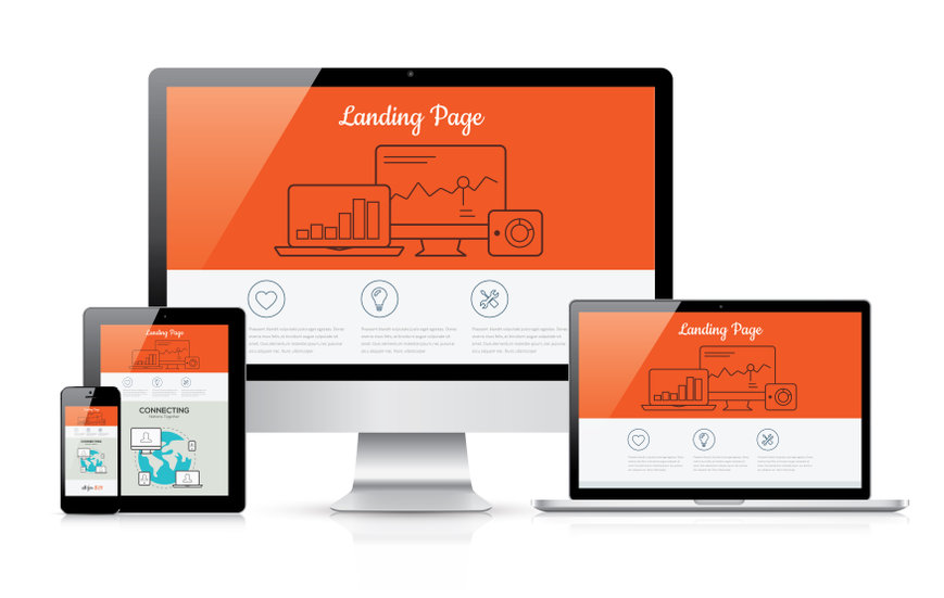
- Mobile-friendliness. If you’re not optimizing landing pages for mobile, you’re not accounting for the approximate 70 percent of web traffic that comes from mobile devices. Eighty-six percent of the most successful landing pages are mobile-friendly. Optimize landing pages and related content for mobile devices. This helps landing pages reach all audiences no matter when or where they are interacting with your site.
- Ongoing web analytics. No page is perfect on the first attempt, especially when aiming to convert leads into customers. It’s important to adopt an ongoing strategy for analyzing the success of landing pages through website analytics with metrics such as click-through rate, form submissions, number of sales follow-ups, click-mapping and conversion rate to understand what is working on the page and what isn’t.
“Statistics from your website will show you which piece of content your users like, what ideas or offers they are responding to, and even which pages or items feel like ‘dead ends’ to your prospects,” say digital marketing experts at The Marcom Group. “None of that can happen, however, unless you are committed to using your web analytics package and testing new concepts regularly.” Similarly, it’s vital to analyze who is interacting with your content, what industry they’re in, their role, the behavior they display and the challenges they’re trying to solve. This information is central to defining, understanding and communicating effectively with target audiences.
Small Yet Mighty

With their highly specialized nature, landing pages can seem simple and straightforward. But optimizing them for an engaging, streamlined user experience takes a strategic effort. Perfecting a landing page can mean the difference between a prospect who clicks away versus one who converts. Keep in mind that no two marketing campaigns are alike. A successful landing page addresses a specific prospect’s need in conjunction with their stage in the buyer’s journey. Through continuous, active efforts to understand your audience, you can create landing pages that resonate with their needs and values. Measure, test and adjust accordingly to develop landing pages that convert.
