In digital marketing, a landing page is a standalone web page designed exclusively for an individual marketing or advertising campaign. When users click a link on an ad, email, call to action request or other marketing initiatives, they are directed to a page that guides them to the next stage of the sales funnel. A landing page might direct users to download content such as a white paper or e-book; to sign up for a newsletter, webinar or event; to join a mailing list; to contact a representative or to make a purchase. When used strategically, landing pages serve as a vital lead generation tool for digital marketing.
Landing Pages Do’s
Landing pages might seem like a simple web page, but each small decision companies make can create a big difference in converting leads. To create landing pages that deliver results, consider the following do’s.
- Do communicate the value of your offer.
A landing page, by nature, offers something of value to a prospect. Whether encouraging prospects to download content or make a purchase decision, a clear and compelling description of the offer’s value is essential. Understanding your target market will help you create messaging that resonates with their buyer personas. What challenges does your offer help prospects tackle? What benefits can users expect? State this clearly and concisely on your landing page to keep this value top of mind and motivate prospects to take action.
- Do provide a clear call-to-action.
Any marketing initiative requires a call to action (CTA) that tells the user what to do next. When it comes to landing pages, the user already clicked through one CTA button to arrive there. It’s important, therefore, to maintain consistent messaging with that initial CTA, the landing page headline and the individual campaign’s offer. Short and eye-catching CTAs help keep the central message at the forefront and encourage users to click.
- Do include a lead-capture form.
A lead-capture form is a tool used to collect prospect data in exchange for accepting your landing page’s offer. This arms your organization with essential information to qualify and connect with leads. Details typically include the prospect’s name, email, phone number and company information such as industry or size. Lead-capture forms can also inquire about prospect challenges, interests or experiences to help you better define your target market. Also, ensure the placement of your form is readily visible to audiences to facilitate an easy exchange.
- Do optimize for mobile.
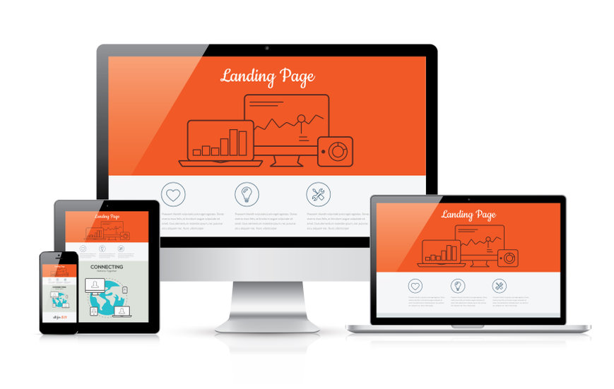
Research shows that 70 percent of web traffic comes from mobile devices. If you’re not accounting for the visitors that interact with your landing pages via mobile, you’re missing a large source of potential leads. Ensure landing pages and related content are optimized for mobile and other devices to reach all audiences no matter when or where they are interacting with your site.

Landing Pages Don’ts
Landing pages are simple in design. To make them effective, avoid these common mistakes.
- Don’t clutter the page.
Landing pages are focused on a singular goal, therefore the design must be similarly focused. Position the lead-capture form and CTA center stage. Relevant and eye-catching graphics can help visual appeal and brand recognition but keep it simple. Interactive graphic content can help make landing pages stylistically appealing while prioritizing function.
- Don’t overload the page with links.
A typical page on your website likely includes site navigation, links to other recommended content and various pathways to tackle multiple goals. A landing page, however, is more focused. Keep link pathways to a minimum. This even includes omitting your site’s main navigation to ensure users stay on a direct path.
- Don’t ask for too much information.
A lead-capture form facilitates the important exchange of prospects’ information but if you overwhelm prospects with too many required fields, you run the risk they will navigate away from your site. Most website visitors have a low tolerance for filling out lengthy forms so ask only for the information you need to contact and qualify your leads. Save the rest of your questions for when your prospect is further down the sales funnel.
A Vital Axis

Landing pages might seem short and simple but optimizing them for user experience can mean the difference between a prospect who clicks away versus one who converts. Think of the landing page like the axis that has the power to turn a passing prospect into a future client. While these do’s and don’ts showcase some best practices of landing pages, no two marketing campaigns are alike. Seek to understand your audience and keep each campaign’s goal top of mind. From there, measure engagement, test new tactics and adjust accordingly to develop results-oriented and winning landing pages.
